Responsive Navigation bar in Next.js 13

July 6, 2023
Welcome to the navigation bar tutorial on Next.js 13!
Here we’ll be covering some exciting topics, including:
- Creating page layouts.
- Routing pages using the “Link” component.
- Utilizing the “Image” component.
The final result will be looking like this:
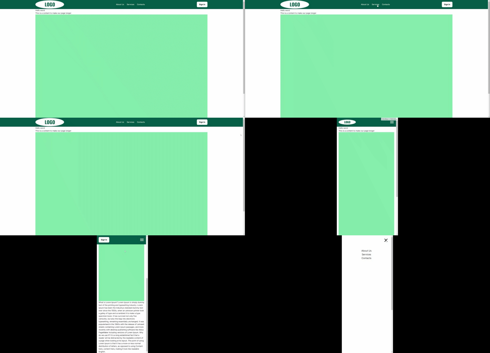
The source code link is included at the end of the article.
Let’s do this step-by-step!
- To get started, simply create a new app by running the command:
npx create-next-app@latest
During the setup process, you’ll be prompted with the following questions:
What is your project named? next-navigation-bar
Would you like to use TypeScript? Yes
Would you like to use ESLint? Yes
Would you like to use Tailwind CSS? Yes
Would you like to use `src/` directory? No
Would you like to use App Router? (recommended) Yes
Would you like to customize the default import alias? No
By default, we have some provided answers but feel free to customize them based on your project requirements and tech stack. In this project, we will be using TypeScript and Tailwind for styling.
To open your new app in the browser, run the command 'npm run dev' and click on the link provided in the terminal (http://localhost:3000). Right now you will see something like this:
-
Inside the 'app' folder, let’s create a 'components' folder. Within the 'components' folder, create a 'navigation' folder with 'navbar' and 'sidebar' folders inside.
The 'navbar' component will be used for the navigation at the top of the page, and the 'sidebar' component will be displayed when the user clicks on the menu button in mobile view.
Create 'index.tsx' files in 'navigation', 'navbar' and 'sidebar' folders.
-
Let’s start with the navbar component and create a basic layout. For convenience, we have created two additional files in the 'navbar' folder: 'Logo.tsx' and 'Button.tsx'. This helps separate their functionality into different files and keeps the <Navbar> clean.
Here is the code for the navigation bar:
import React from "react";
import Link from "next/link";
import Logo from "./Logo";
import Button from "./Button";

const Navbar = () => {
    return (
        <>
            <div className="w-full h-20 bg-emerald-800 sticky top-0">
                <div className="container mx-auto px-4 h-full">
                    <div className="flex justify-between items-center h-full">
                        <Logo/>
                        <ul className="hidden md:flex gap-x-6 text-white">
                            <li>
                                <Link href="/about">
                                    <p>About Us</p>
                                </Link>
                            </li>
                            <li>
                                <Link href="/services">
                                    <p>Services</p>
                                </Link>
                            </li>
                            <li>
                                <Link href="/contacts">
                                    <p>Contacts</p>
                                </Link>
                            </li>
                        </ul>
                        <Button/>
                    </div>
                </div>
            </div>
        </>
    );
};

export default Navbar;
- Now, let’s prepare our pages.
How does routing work in the latest version of Next.js (13) with the ‘app’ folder structure? According to the official documentation:
“Next.js uses a file-system-based router where folders are used to define routes. A route is a single path of nested folders, following the file-system hierarchy from the root folder down to a final leaf folder that includes a page.js file.”
You can read more about it in detail here.
In simple terms, to create a route, you need to create a folder with the route name and include a 'page.js' file inside that folder. This 'page.js' file will determine the content of the page.
For example, the folder structure 'app/about/page.tsx' will correspond to the URL '/about'. Similarly, for nested URLs, the folder structure 'app/about/team/leadership/page.tsx' will correspond to the URL '/about/team/leadership'.
The crucial point is that a folder must contain a 'page.js' file for it to be a URL path. In our example, we have created a 'components' folder, which will not be a URL path because it doesn't have a 'page.js' file inside.
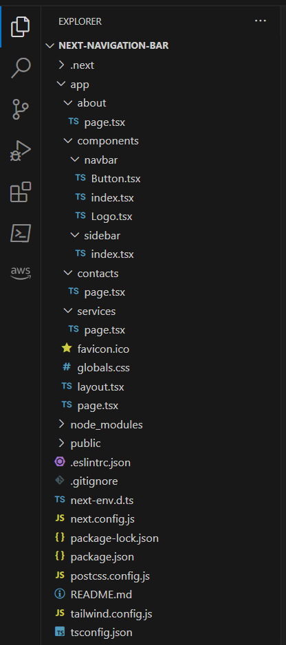
We will create three folders in the 'app' folder for our pages: 'about', 'services', and 'contacts'. After this step,our project file structure will look like this:
- To modify the content of our pages, open the 'page.tsx' file in the 'app' folder and remove all the default content. Replace it with something that makes the page height greater than the screen height.
export default function Home() {
    return (
        <>
            <div className="container mx-auto px-4">
                <h1>Hello word</h1>
                <p>This is a content to make our page longer</p>
                <div className="w-full h-screen bg-green-300"></div>
                <p>
                    Lorem Ipsum is simply dummy text ...
                </p>
            </div>
        </>
    );
}
- In the files within the ‘'about', 'services', and 'contacts' folders, add basic content like this:
import React from "react";

const About = () => {
    return <div>About</div>;
};

export default About;
- Now, let’s remove all styles from the 'globals.css' file.
@tailwind base;
@tailwind components;
@tailwind utilities;
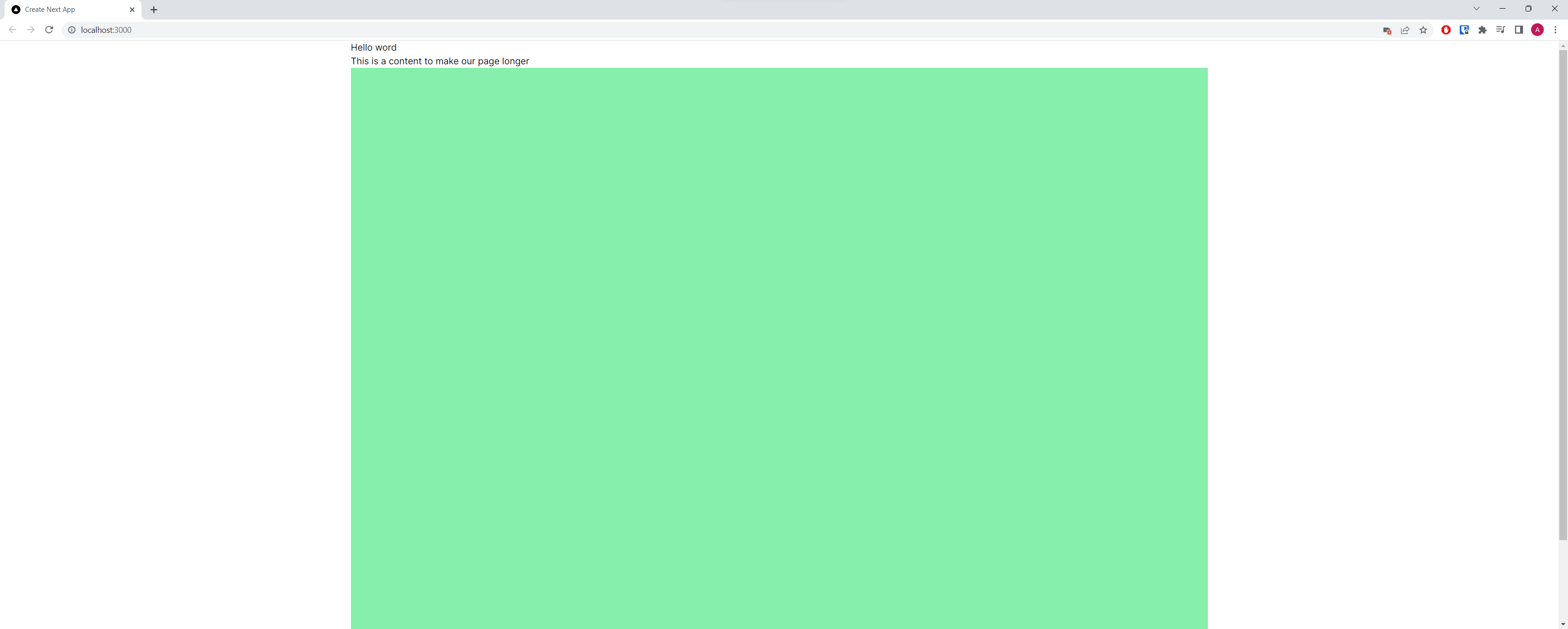
Our page will look like this:
- To add a navigation bar to all of our pages, open 'layout.tsx' and place the <Navigation> tag above the {children} element.
import Navigation from "./components/navbar";
import "./globals.css";
import {Inter} from "next/font/google";

const inter = Inter({subsets: ["latin"]});

export const metadata = {
    title: "Create Next App",
    description: "Generated by create next app",
};

export default function RootLayout({
                                       children,
                                   }: {
    children: React.ReactNode;
}) {
    return (
        <html lang="en">
        <body className={inter.className}>
        <Navigation/>
        {children}
        </body>
        </html>
    );
}
-
In 'navigation/index.tsx' we add a state of Sidebar (open or close) and functionality to open and close it. Add 'use client' on top, to use 'useState' hook.
The Navigation component will return both Sidebar and Navbar components.
"use client";
import {useState} from "react";
import Navbar from "./navbar";
import Sidebar from "./sidebar";

const Navigation = () => {
    const [isOpen, setIsOpen] = useState(false);
    const toggle = () => {
        setIsOpen(!isOpen);
    };
    return (
        <>
            <Sidebar isOpen={isOpen} toggle={toggle}/>
            <Navbar toggle={toggle}/>
        </>
    );
};

export default Navigation;
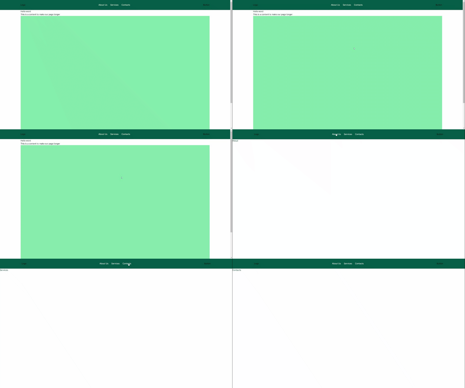
Our page will look like this and the links will take us to other pages.
-
The next step is to create a logo that will turn into a contact button when the user scrolls below the hero section on the mobile view of the website. To do this, follow these steps:
Create an 'images' folder inside the 'public' folder and place 'logo.png' inside it. Edit 'Logo.tsx' and add the following code to adjust the logo image size based on the screen width:
"use client";
import Image from "next/image";
import {useEffect, useState} from "react";
import Link from "next/link";
import Button from "./Button";

const Logo = () => {
    const [width, setWidth] = useState(0);
    const updateWidth = () => {
        const newWidth = window.innerWidth;
        setWidth(newWidth);
    };
    useEffect(() => {
        window.addEventListener("resize", updateWidth);
        updateWidth();
    }, []);
}
Wrap the <Image> component in a <Link> component, it will lead to the homepage:
<Link href="/" style={{display: showButton ? "none" : "block"}}>
    <Image src="/images/logo.png" alt="Logo" width={width < 1024 ? "150" : "250"}
           height={width < 1024 ? "45" : "74"} className="relative"/>
</Link>
Please note that we add 'use client' on top because we want to use the 'useState' hook. Also, the 'updateWidth' function is placed inside the 'useEffect' hook because it references the 'window' object, which is only available on the client side. If we don’t use 'useEffect', we will encounter a 'ReferenceError: window is not defined'.
- Now we want our logo to be replaced with a button, so let’s add the following code:
  const [showButton, setShowButton] = useState(false);
const changeNavButton = () => {
    if (window.scrollY >= 400 && window.innerWidth < 768) {
        setShowButton(true);
    } else {
        setShowButton(false);
    }
};
useEffect(() => {
    window.addEventListener("scroll", changeNavButton);
}, []);
Add the <Button> component right after the <Image> component:
<div style={{display: showButton ? "block" : "none"}}>
    <Button/>
</div>
The final version of 'Logo.tsx' will look like this:
"use client";
import Image from "next/image";
import {useEffect, useState} from "react";
import Link from "next/link";
import Button from "./Button";

const Logo = () => {
    //update the size of the logo when the size of the screen changes
    const [width, setWidth] = useState(0);

    const updateWidth = () => {
        const newWidth = window.innerWidth;
        setWidth(newWidth);
    };

    useEffect(() => {
        window.addEventListener("resize", updateWidth);
        updateWidth();
    }, []);

    // change between the logo and the button when the user scrolls
    const [showButton, setShowButton] = useState(false);

    const changeNavButton = () => {
        if (window.scrollY >= 400 && window.innerWidth < 768) {
            setShowButton(true);
        } else {
            setShowButton(false);
        }
    };

    useEffect(() => {
        window.addEventListener("scroll", changeNavButton);
    }, []);

    return (
        <>
            <Link href="/" style={{display: showButton ? "none" : "block"}}>
                <Image
                    src="/images/logo.png"
                    alt="Logo"
                    width={width < 1024 ? "150" : "250"}
                    height={width < 1024 ? "45" : "74"}
                    className="relative"
                />
            </Link>
            <div
                style={{
                    display: showButton ? "block" : "none",
                }}
            >
                <Button/>
            </div>
        </>
    );
};

export default Logo;
- To style our Button component, please add the necessary styles to 'Button.tsx'.
const Button = () => {
    return (
        <button className="h-12 rounded-lg bg-white font-bold px-5">Sign In</button>
    );
};
export default Button;
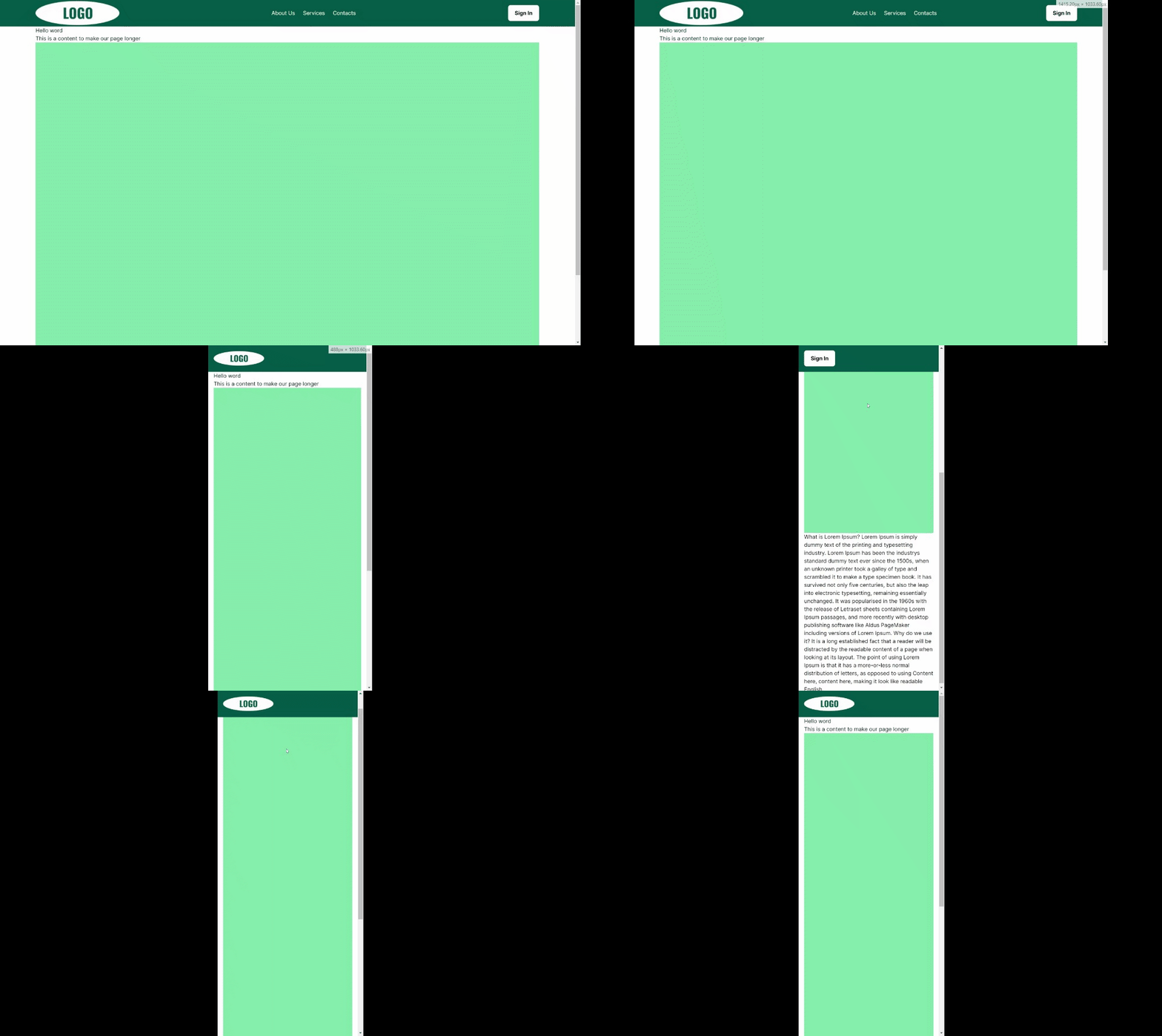
At this point, our app should look like this:
- In the Sidebar component wrap everything in a div with the following styling:
<div className="sidebar-container fixed w-full h-full overflow-hidden
   justify-center bg-white grid pt-[120px] left-0 z-10"
     style={{
         opacity: `${isOpen ? "1" : "0"}`,
         top: ` ${isOpen ? "0" : "-100%"}`
     }}>
    ...
</div>
By doing this, we will hide the menu when it is not open.
Next, add a close button at the top and the necessary links. Both the close button and the links should have an onClick={toggle} property to close the menu when clicked.
The complete code for the <Sidebar> component will look like this:
import Link from "next/link";

const Sidebar = ({
                     isOpen,
                     toggle,
                 }: {
    isOpen: boolean;
    toggle: () => void;
}): JSX.Element => {
    return (
        <>
            <div
                className="sidebar-container fixed w-full h-full overflow-hidden justify-center bg-white grid pt-[120px] left-0 z-10"
                style={{
                    opacity: `${isOpen ? "1" : "0"}`,
                    top: ` ${isOpen ? "0" : "-100%"}`,
                }}
            >
                <button className="absolute right-0 p-5" onClick={toggle}>
                    {/* Close icon */}
                    <svg xmlns="http://www.w3.org/2000/svg" width="48" height="48" viewBox="0 0 24 24">
                        <path
                            fill="currentColor"
                            d="M19 6.41L17.59 5L12 10.59L6.41 5L5 6.41L10.59 12L5 17.59L6.41 19L12 13.41L17.59 19L19 17.59L13.41 12L19 6.41Z"
                        />
                    </svg>
                </button>

                <ul className="sidebar-nav text-center leading-relaxed text-xl">
                    <li>
                        <Link href="/about" onClick={toggle}><p>About Us</p></Link>
                    </li>
                    <li>
                        <Link href="/services" onClick={toggle}><p>Services</p></Link>
                    </li>
                    <li>
                        <Link href="/contacts" onClick={toggle}><p>Contacts</p></Link>
                    </li>
                </ul>
            </div>
        </>
    );
};

export default Sidebar;
- Finally, let’s add a menu icon to the Navbar with onClick={toggle} as well.
<button type="button" className="inline-flex items-center md:hidden"
        onClick={toggle}>
    {/* Menu icon */}
    <svg xmlns="http://www.w3.org/2000/svg"
         width="40"
         height="40"
         viewBox="0 0 24 24">
        <path fill="#fff"
              d="M3 6h18v2H3V6m0 5h18v2H3v-2m0 5h18v2H3v-2Z"/>
    </svg>
</button>
The final result will look like this:

Thank you to everyone who enjoyed the article!
You can find the source code files here.